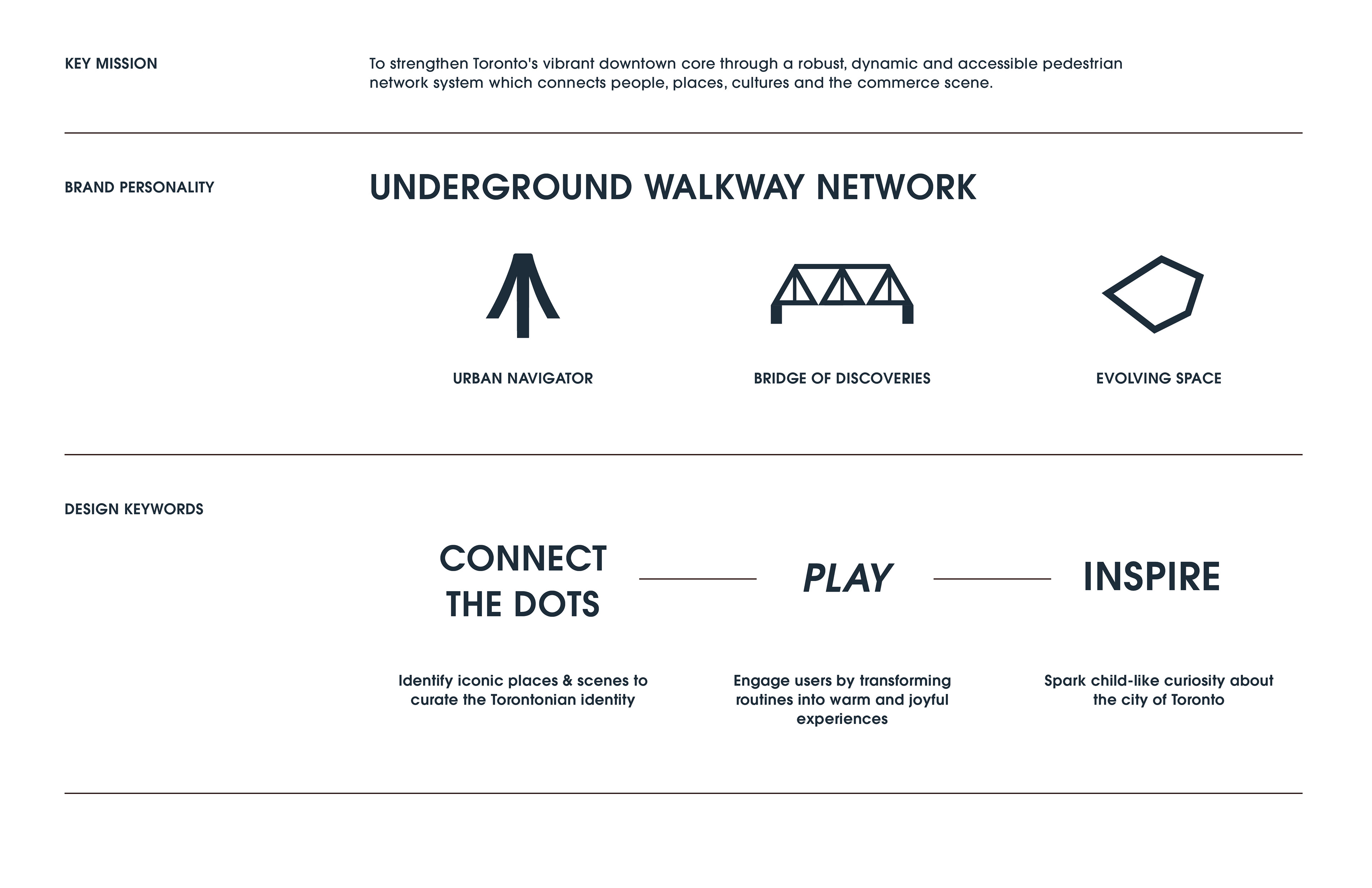
Since the 1900s, Toronto's underground walkway system has grown into a part of the city's core— by serving its business community, local residents and visitors as an urban connector to transit stations. Today, the PATH has evolved from being just a practical link between buildings — into a dynamic network that shapes how people experience downtown.
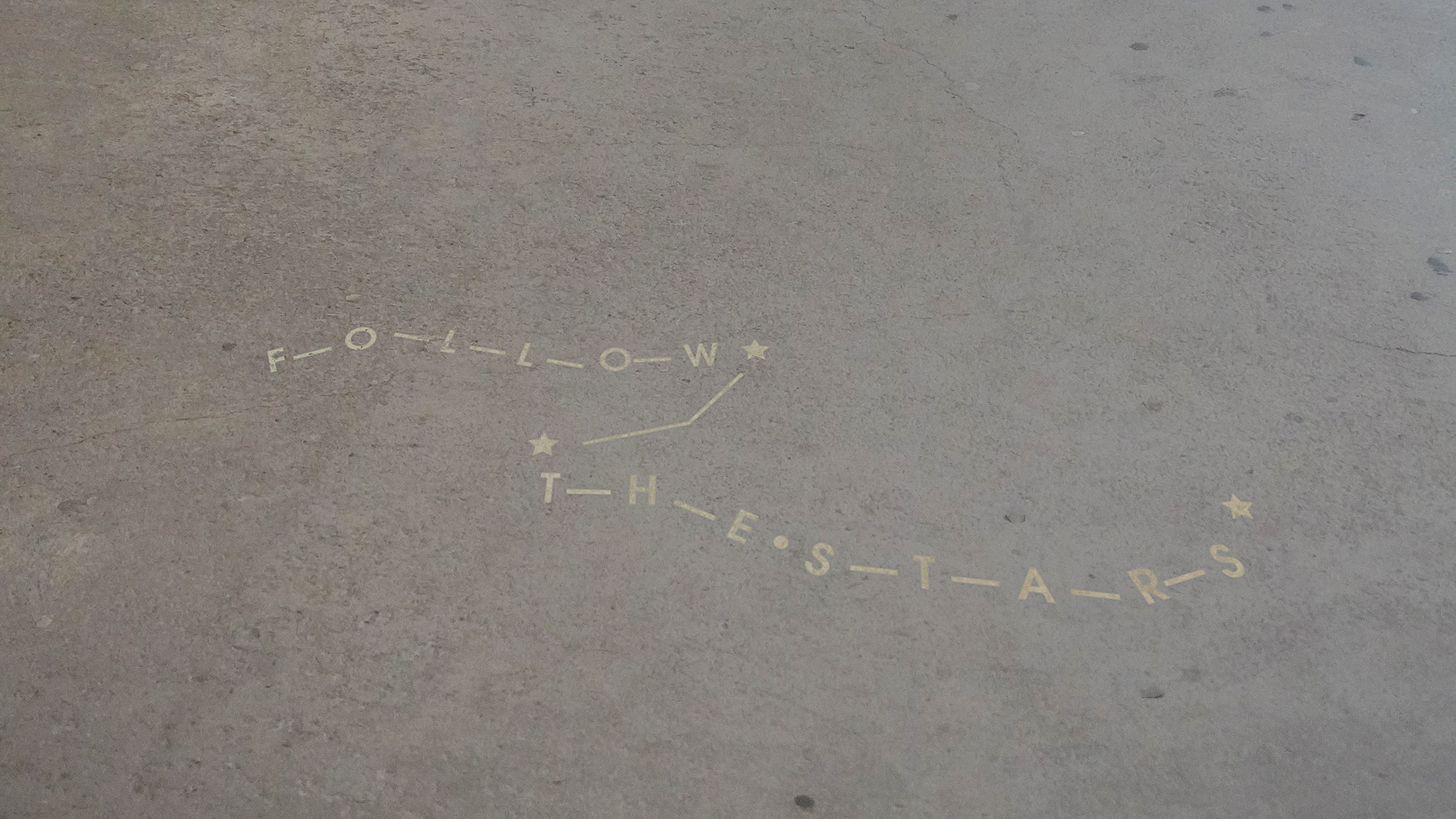
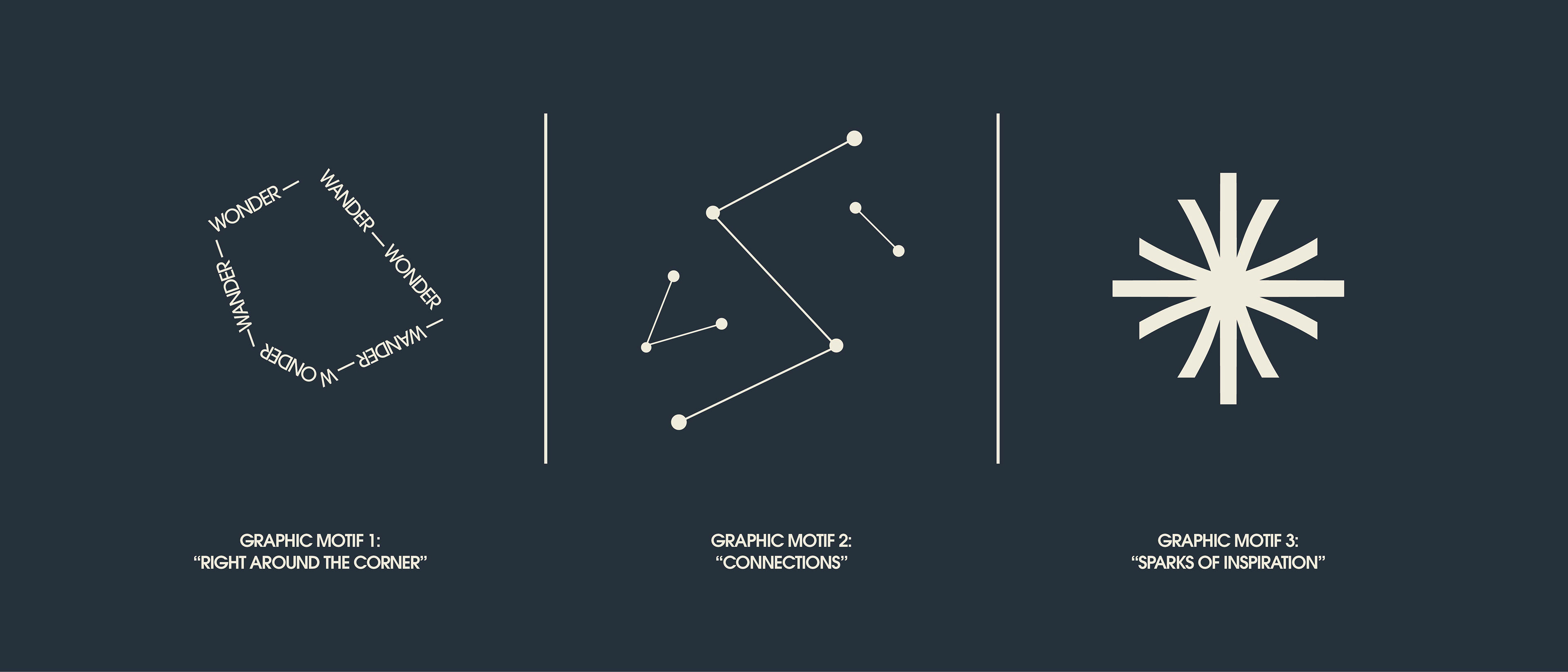
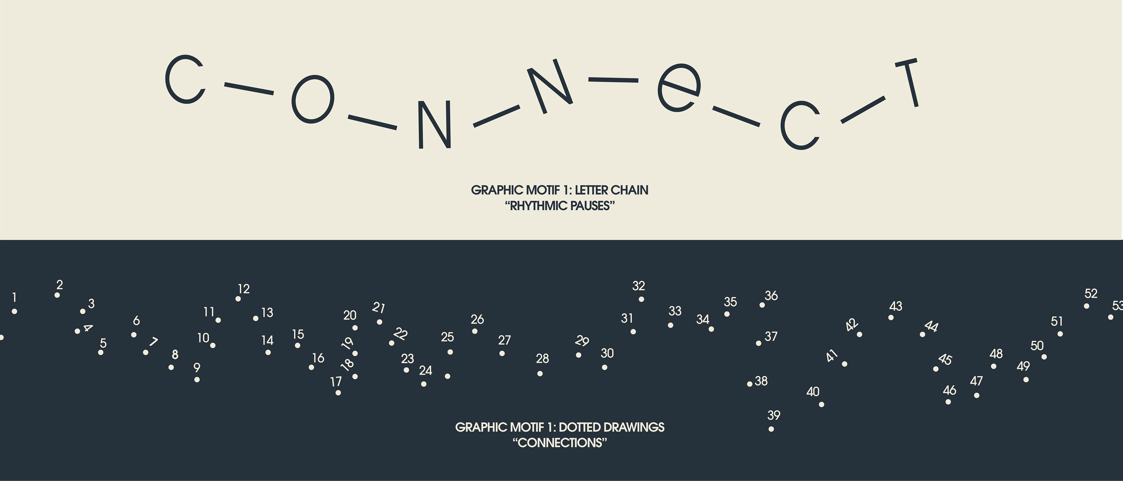
This project not only sees PATH as a guide to Toronto, but revitalizes it by designing a distinctive and vibrant narrative for it. It reframes the daily commuters' routine by using elements of play (familiar games of connecting dots) to spark interest
and curiosity about the city they have set foot in.
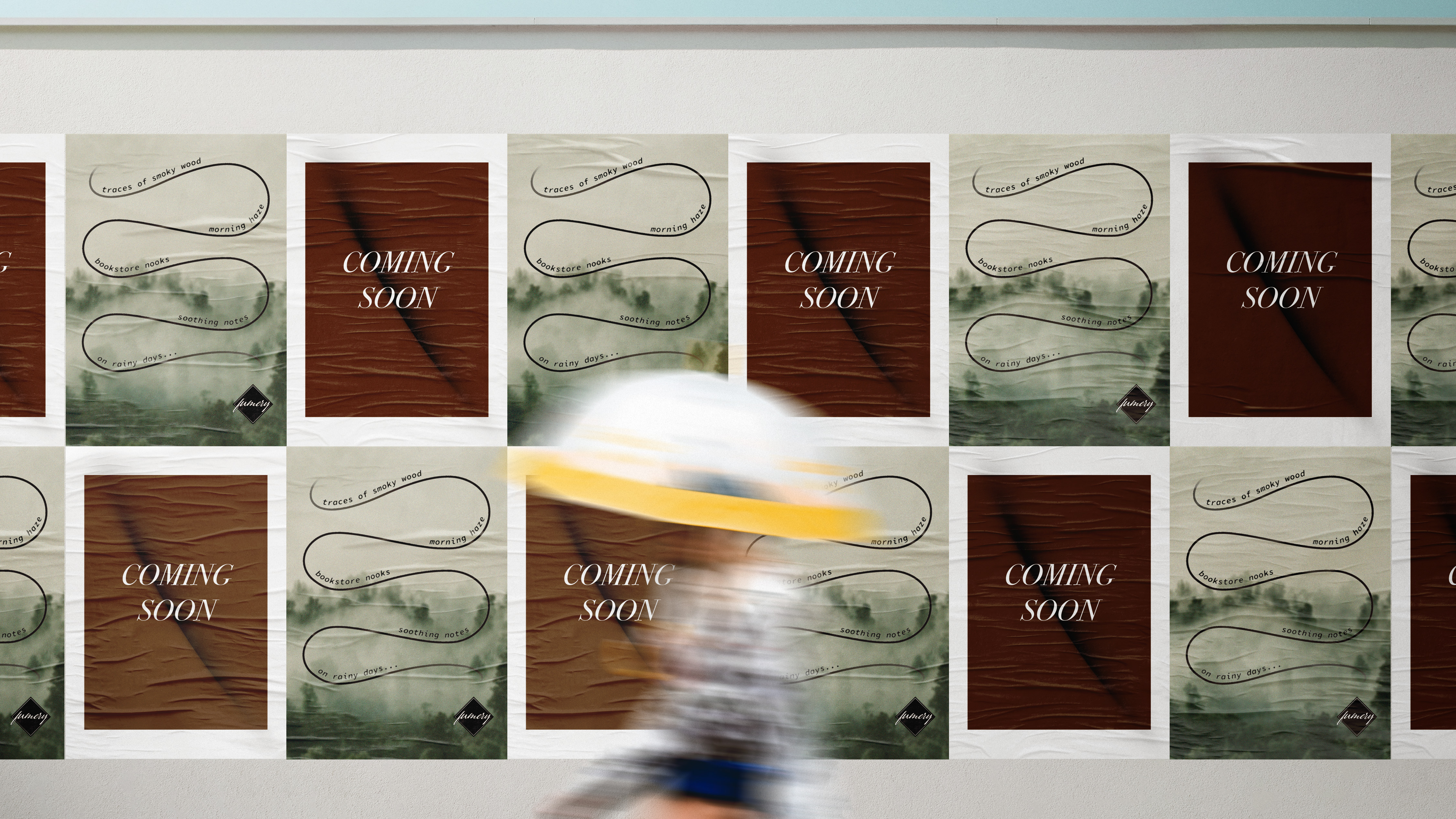
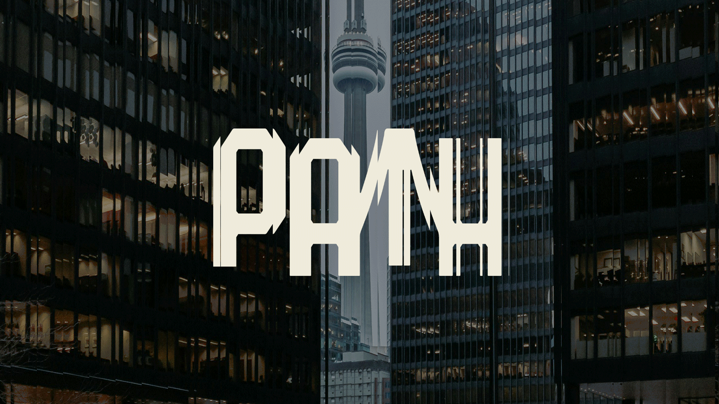
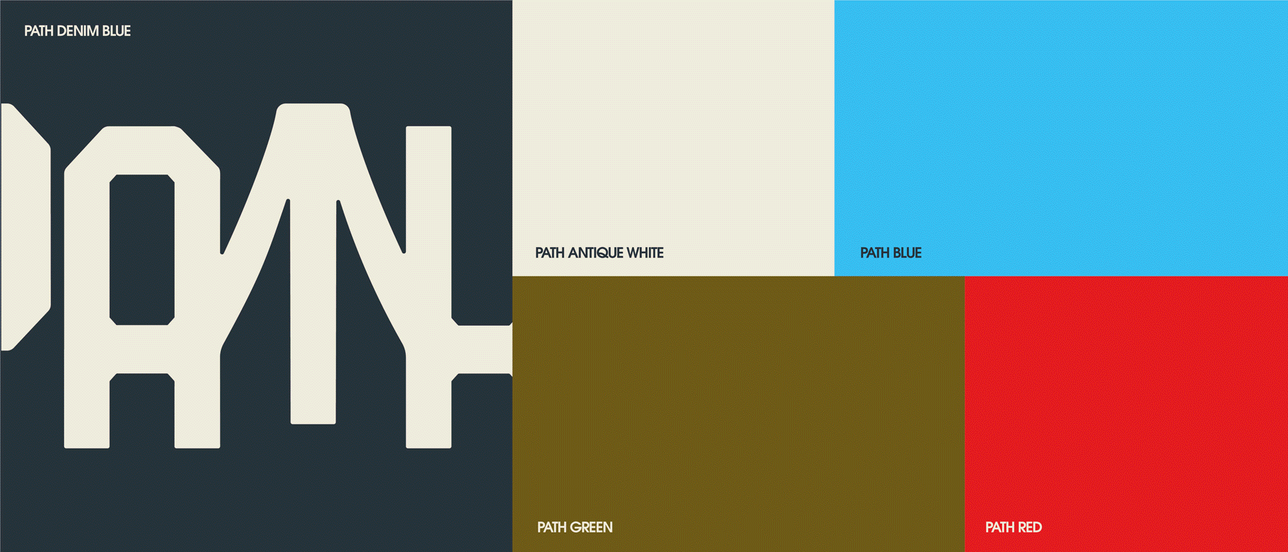
The wordmark created sets the tone for the design system by communicating the visuals of a bridge that moves with you (your eyes, specifically). The angular details references the infrastructure of bridges, while hiding the corners of gemstones. The concept of finding hidden gems in the city carries into the design system, reflected through the Toronto-centric color palette, light yet expressive typography and playful motifs —
because in this city, the next adventure is always just around the corner.
This project not only sees PATH as a guide to Toronto, but revitalizes it by designing a distinctive and vibrant narrative for it. It reframes the daily commuters' routine by using elements of play (familiar games of connecting dots) to spark interest
and curiosity about the city they have set foot in.
The wordmark created sets the tone for the design system by communicating the visuals of a bridge that moves with you (your eyes, specifically). The angular details references the infrastructure of bridges, while hiding the corners of gemstones. The concept of finding hidden gems in the city carries into the design system, reflected through the Toronto-centric color palette, light yet expressive typography and playful motifs —
because in this city, the next adventure is always just around the corner.
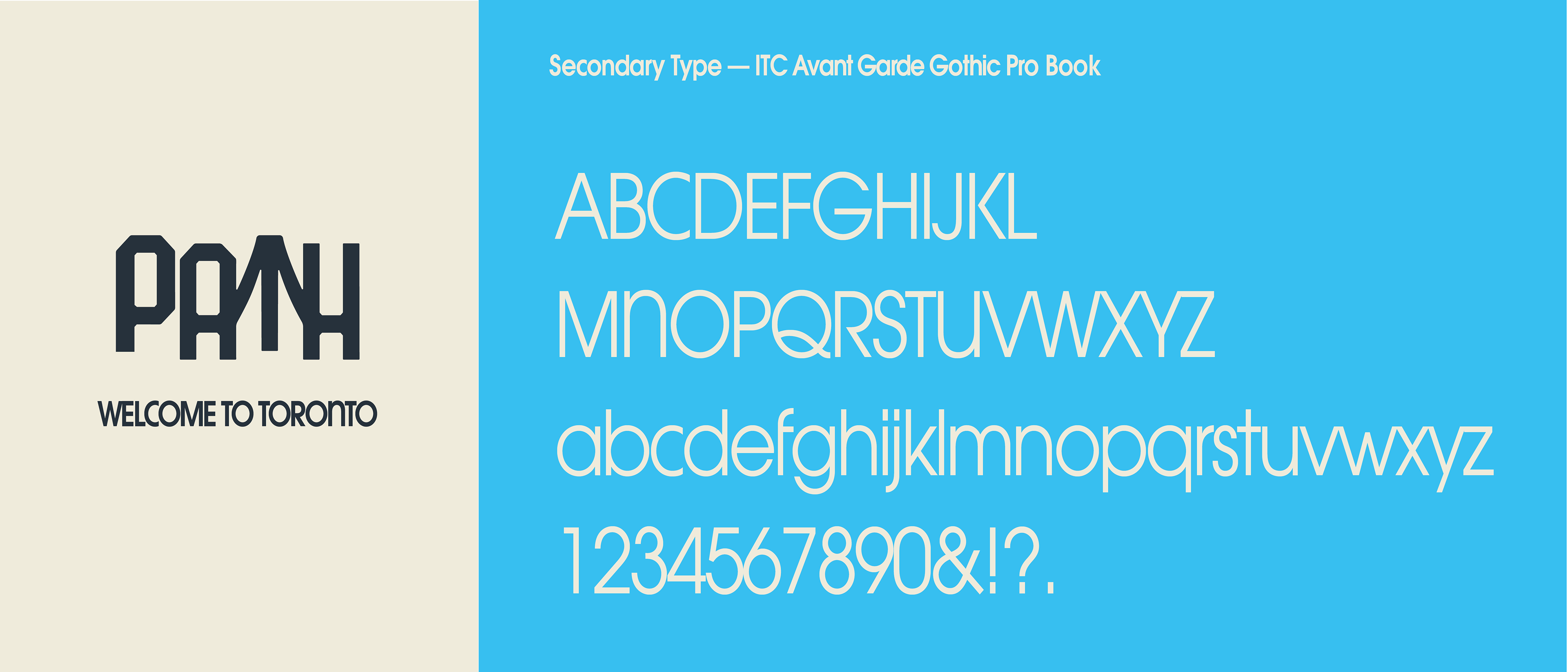
The existing wordmark for PATH has four different designs and colors for each letter in the name to represent the four cardinal directions ("P" for South, "A" for West, "T" for North and "H" for East).
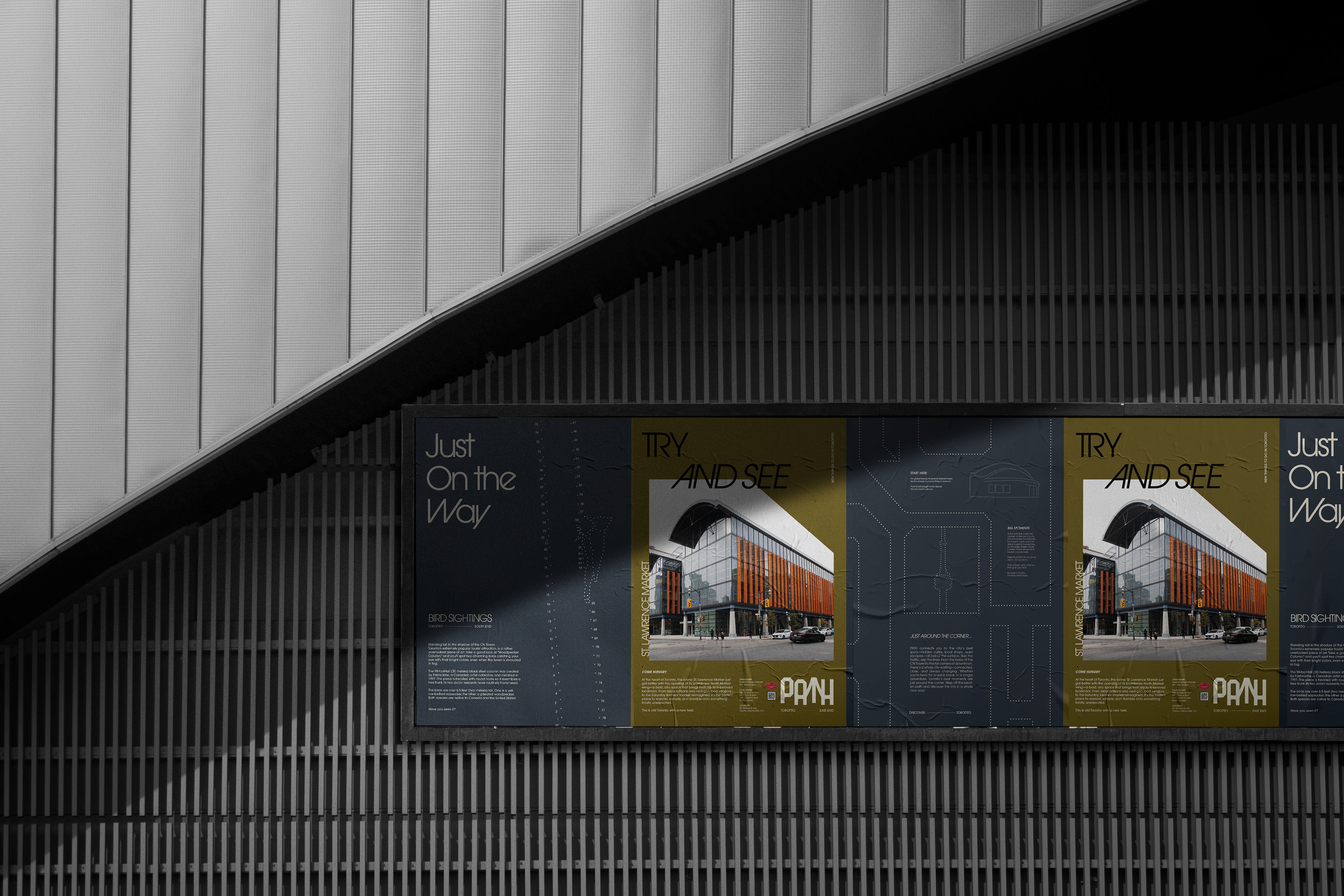
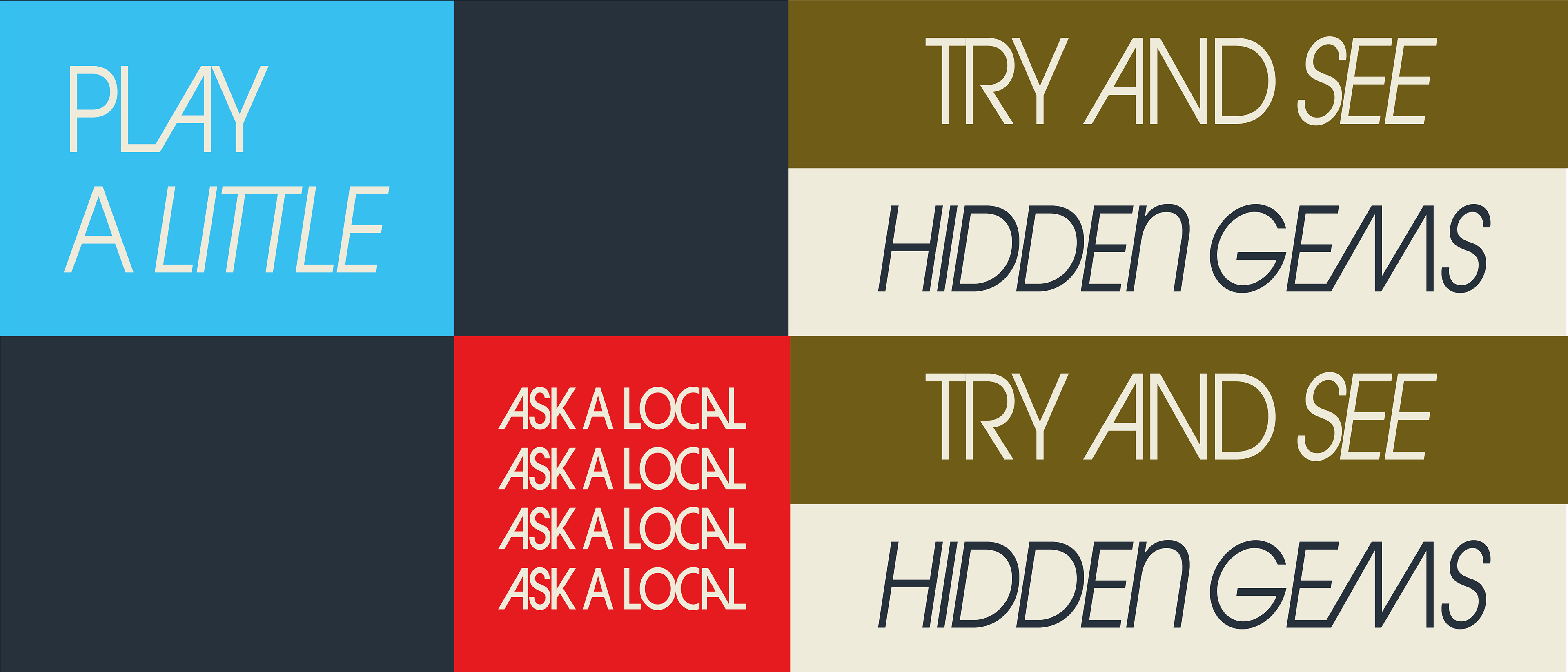
In the new design, this layer of meaning is retained through the use of colors — but in the extended designs for posters promoting places in Toronto, which will be placed in subway stations in the corresponding transit direction. Building on that, I also used the letters of the PATH to create a set of slogans to create a unified brand voice that engages and invites people to explore the city.
In the new design, this layer of meaning is retained through the use of colors — but in the extended designs for posters promoting places in Toronto, which will be placed in subway stations in the corresponding transit direction. Building on that, I also used the letters of the PATH to create a set of slogans to create a unified brand voice that engages and invites people to explore the city.
A choice of modern and sharp colors to
showcase the richness of Toronto's vibrant core.
showcase the richness of Toronto's vibrant core.
.
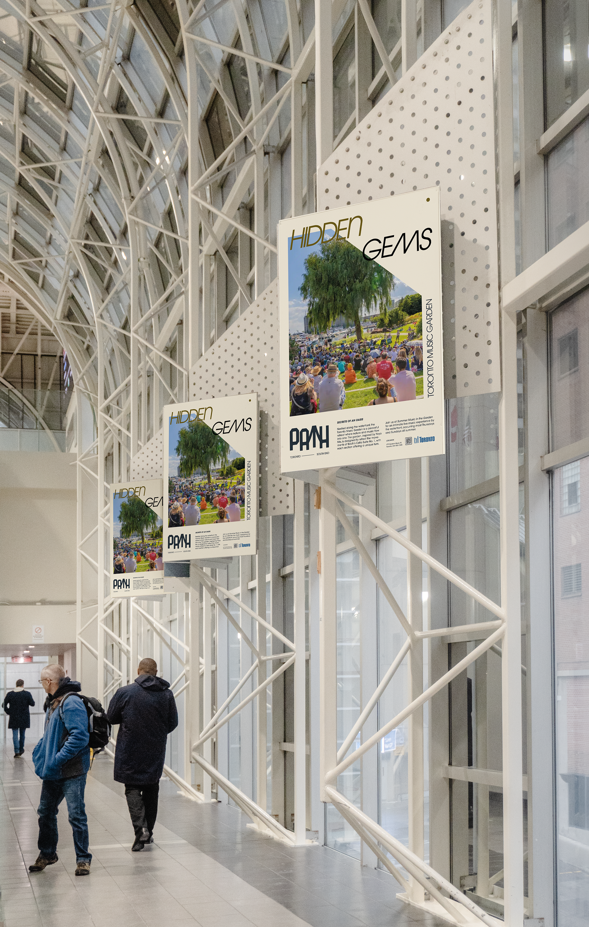
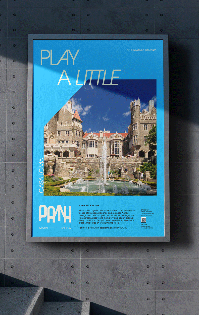
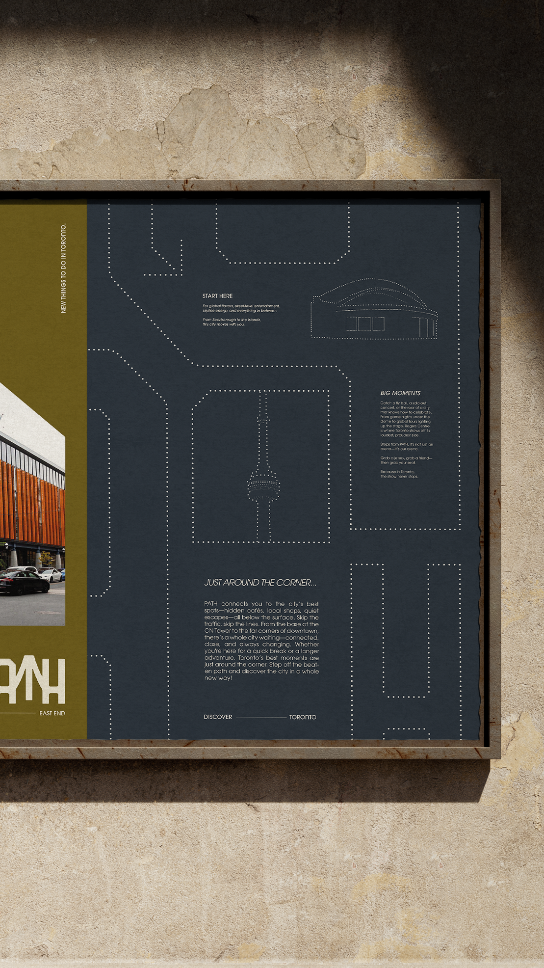
"Color-coded posters are designed as part of a graphic framework placed throughout the PATH. They function as both directional signage and informative guides highlighting city events, landmarks and wayfinding cues for tourists and commuters alike."
Interviews with Union Station staff offered valuable insights into pedestrian behavior, particularly in areas where commuters often become disoriented after exiting the train and subway system.
These findings directly informed design decisions around wayfinding clarity. Each poster is color-coded according to cardinal directions, providing vibrant visual cues and intuitive spatial orientation for users navigating through the underground network. To support accessibility, directional information is reinforced with contextual content, ensuring legibility for users with color vision deficiencies.
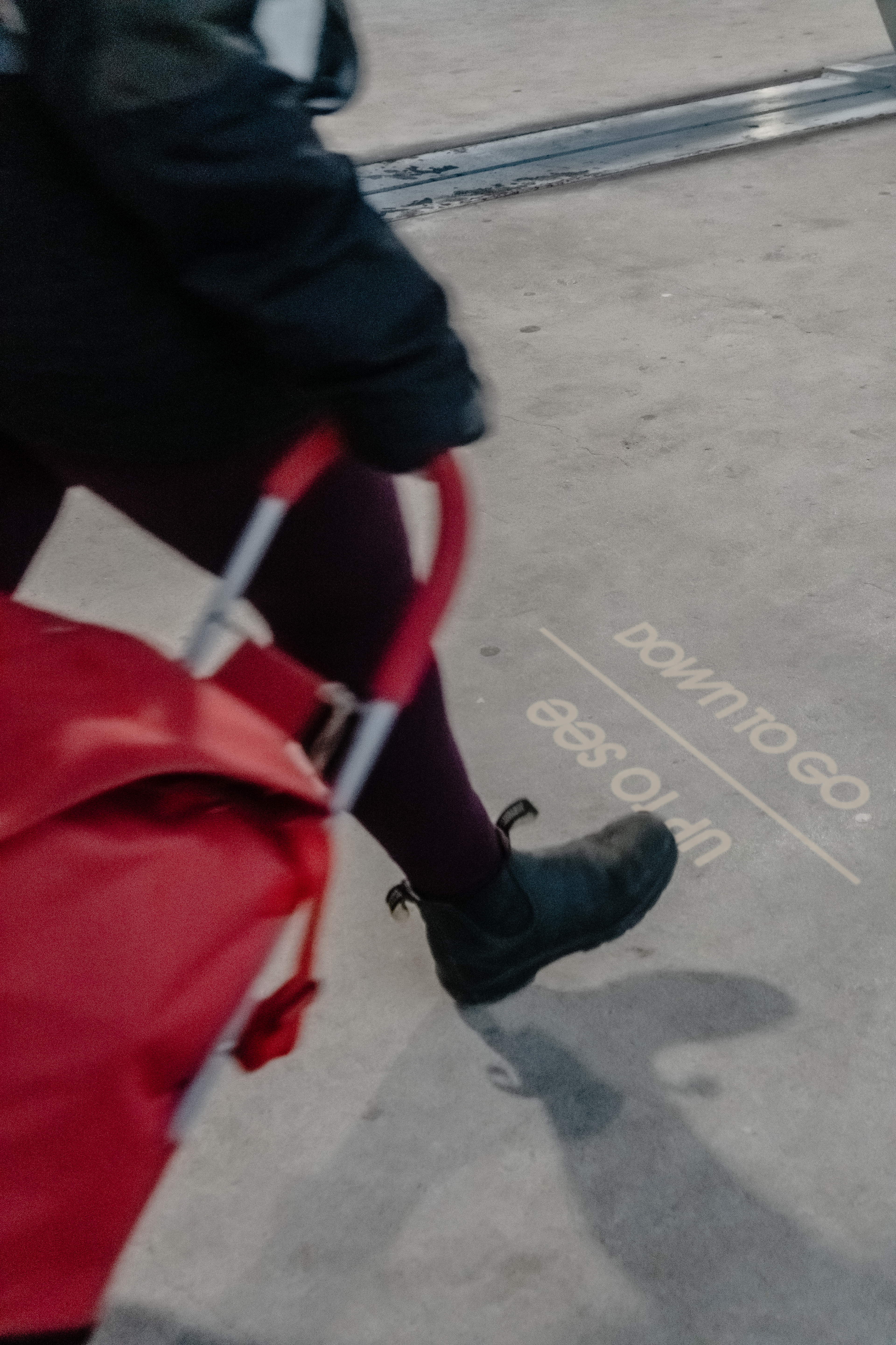
Designing for Flow,
Pause & Curiosity
Pause & Curiosity
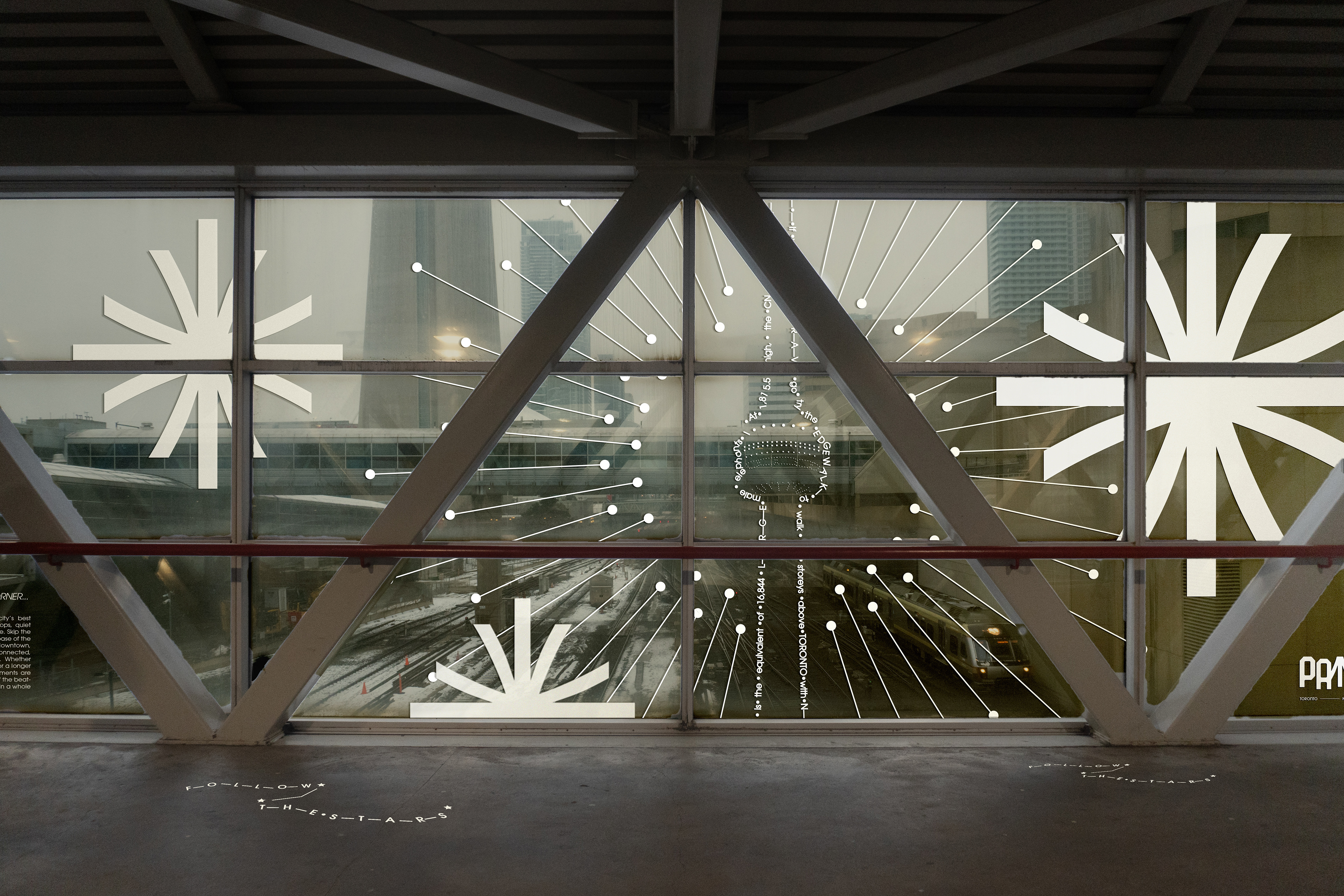
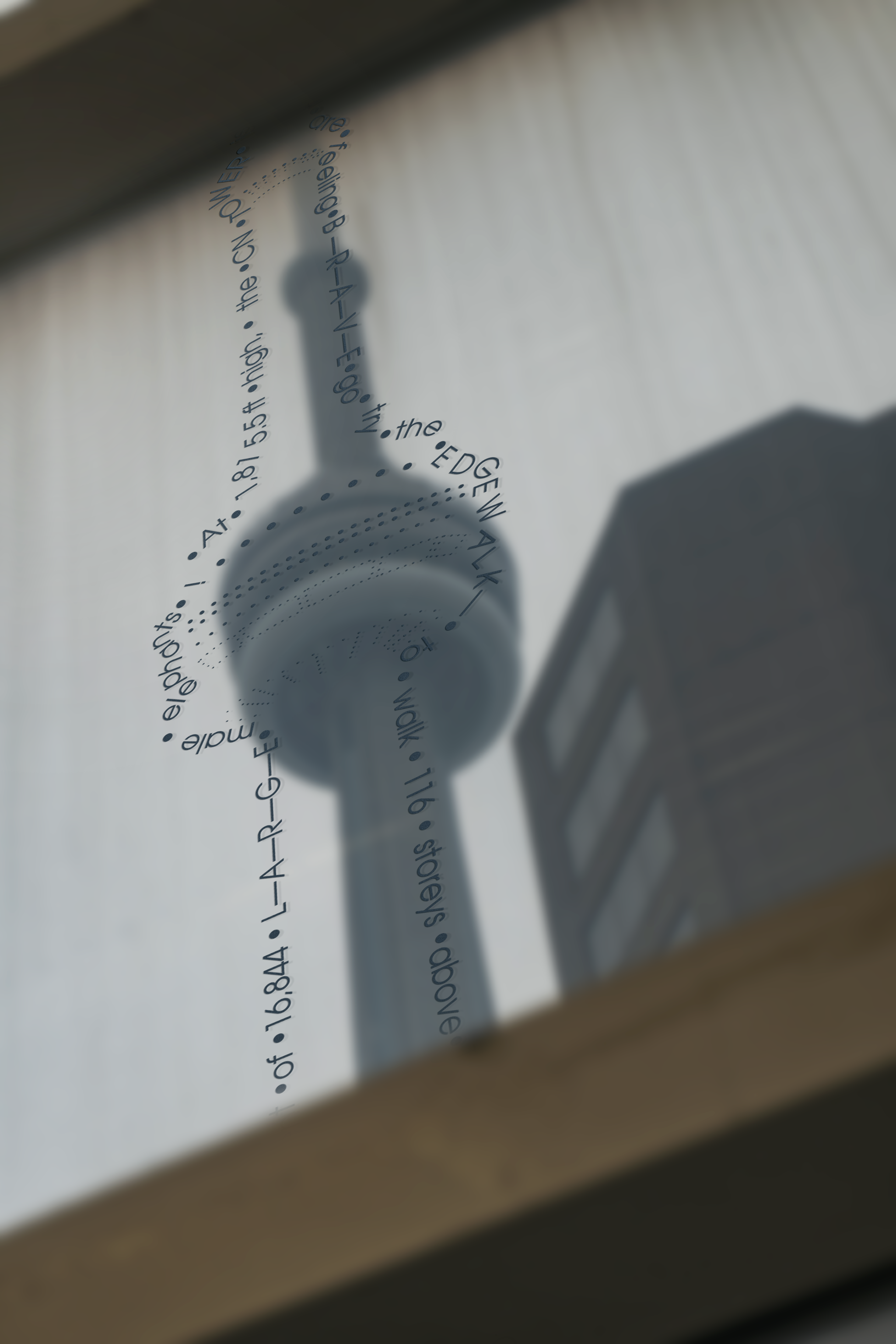
Using radial and illustrative window graphics to draw pedestrians' attention to landmarks along the PATH
To clearly understand how people interact with the PATH Skywalk, on-site observations and interviews were conducted at different times of the day - including morning rush hour, midday, later afternoon and evening. These sessions revealed significant shifts in the crowd density and movement patterns of different user types (commuters, event-attending professionals, tourists and families).
An intriguing pattern emerged during observation: children frequently ran along the pathway and approached the Skywalk windows to observe the view beyond, often pausing to watch trains or city movement. This behavior highlighted how even transitional spaces can invite moments of wonder and emotional engagement. In response, the design prioritizes clear sightlines and framed views of the city gems to encourage these spontaneous interactions while maintaining the lighting condition in the space.