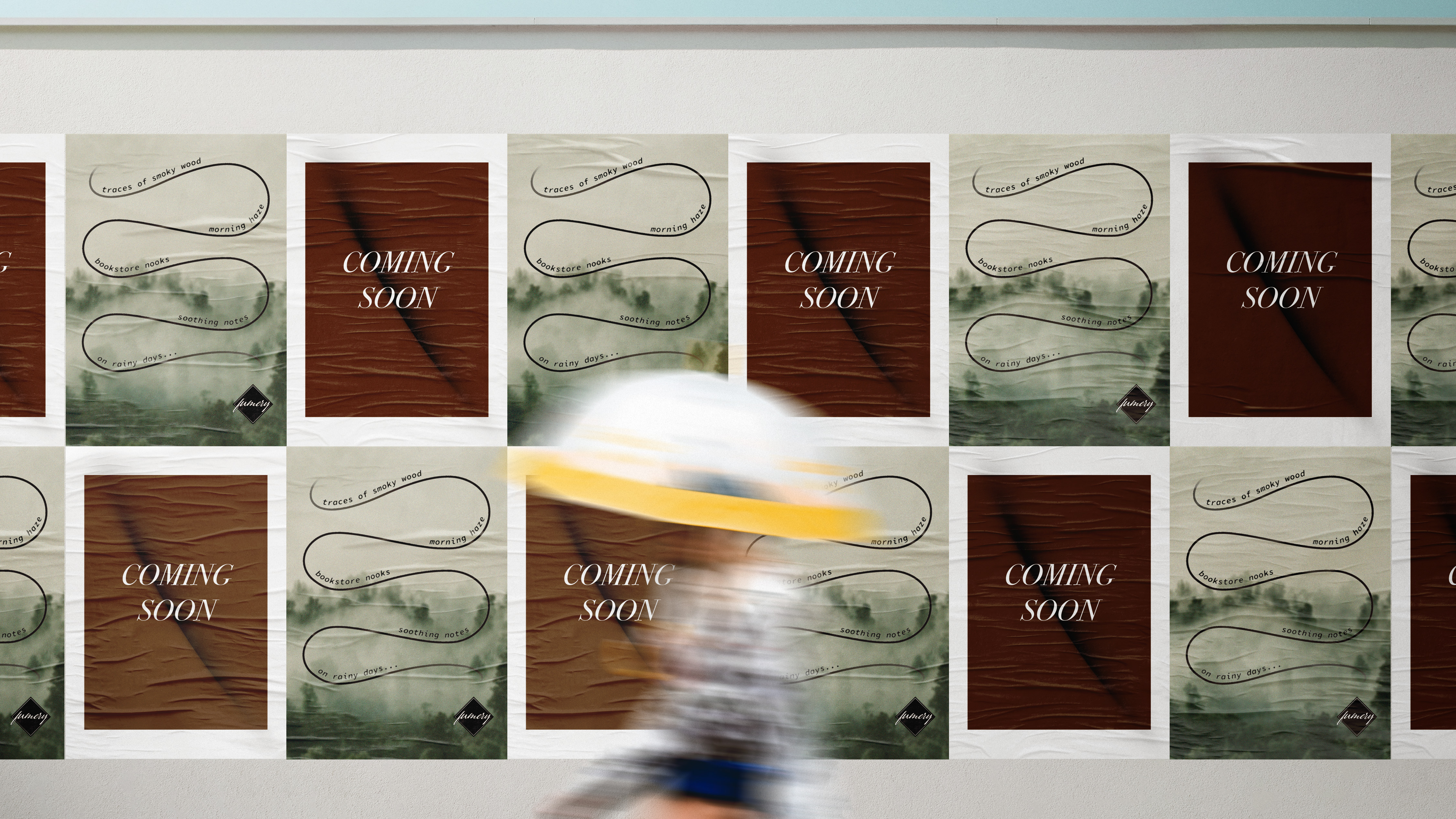
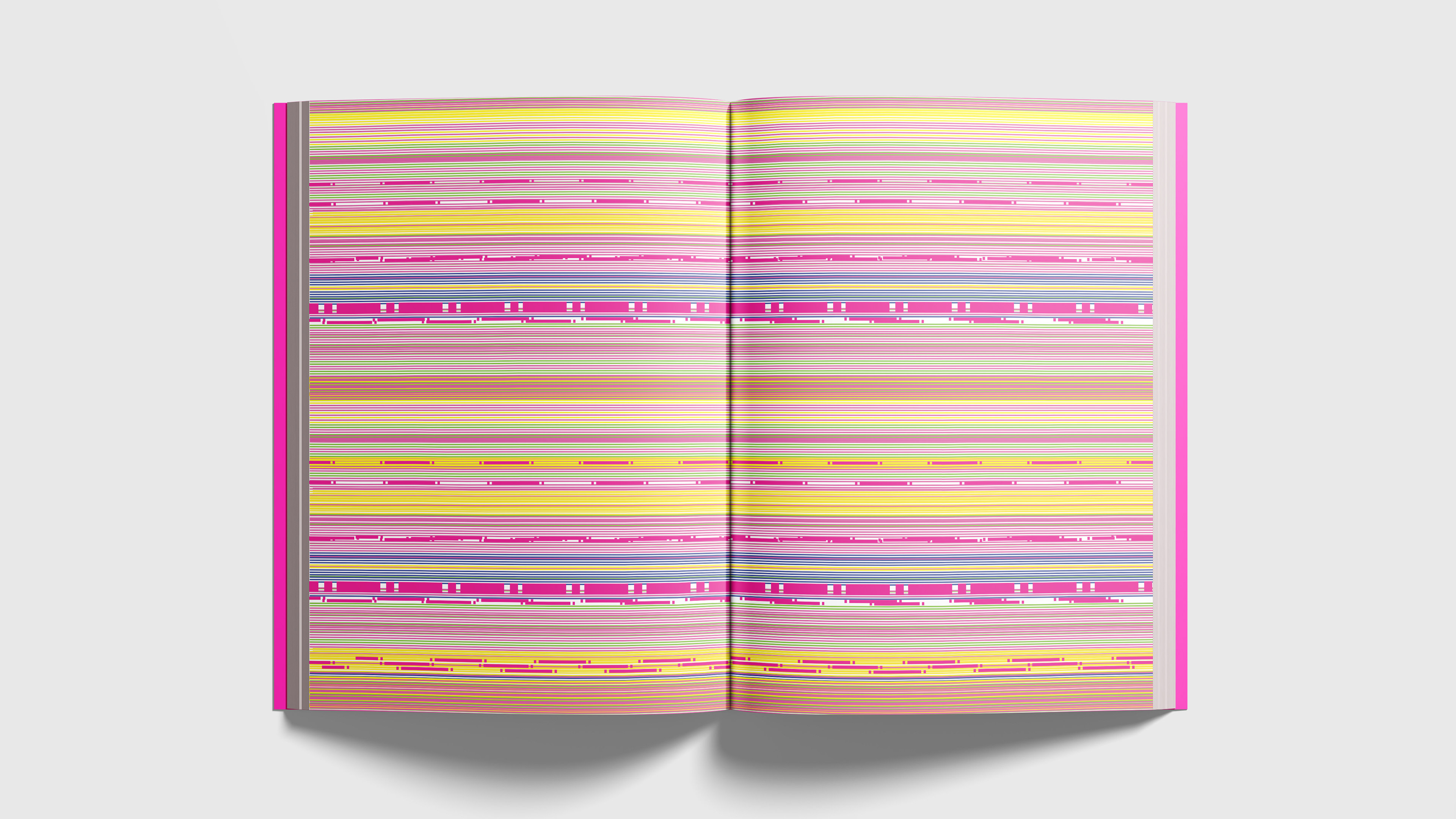
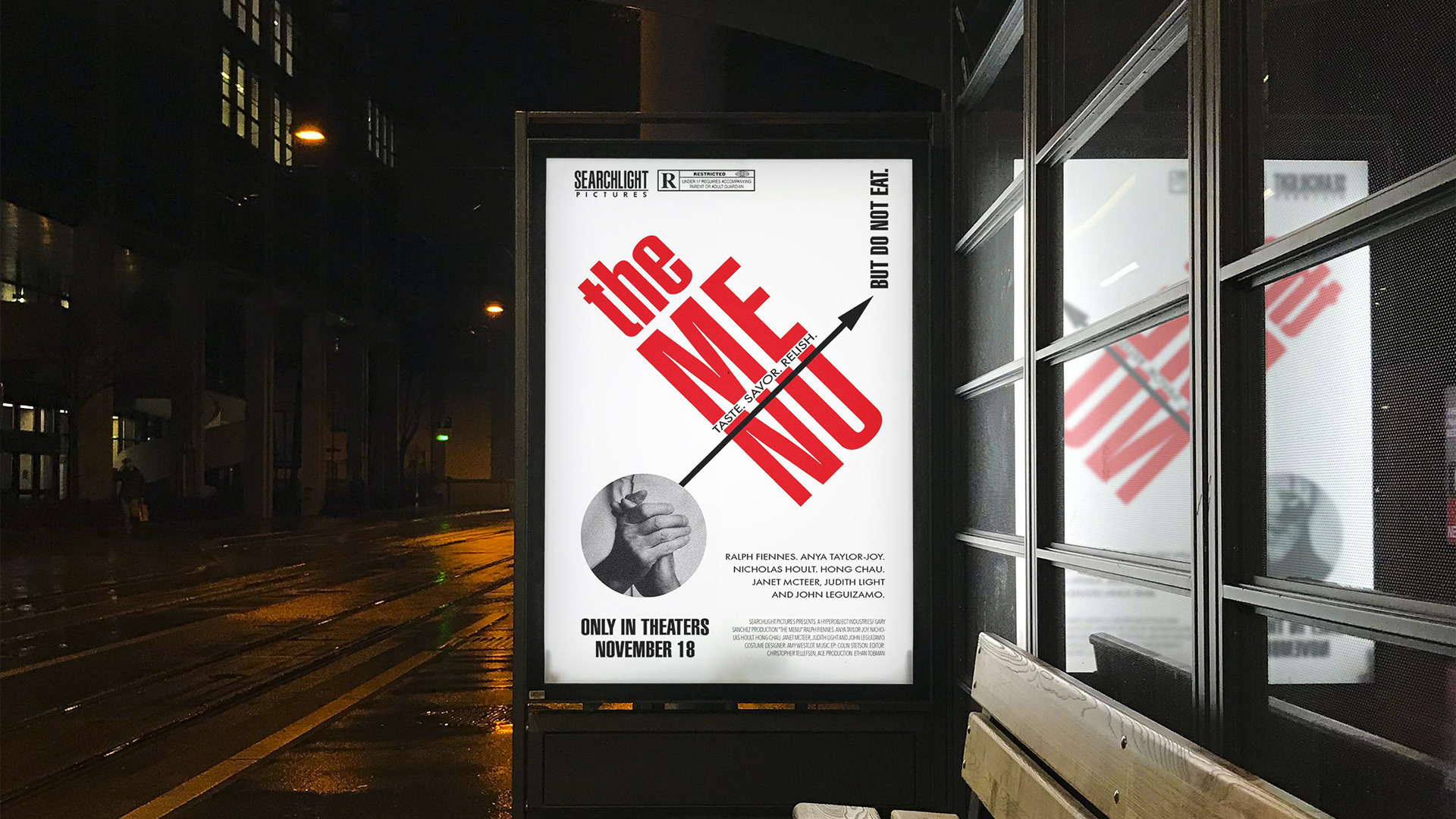
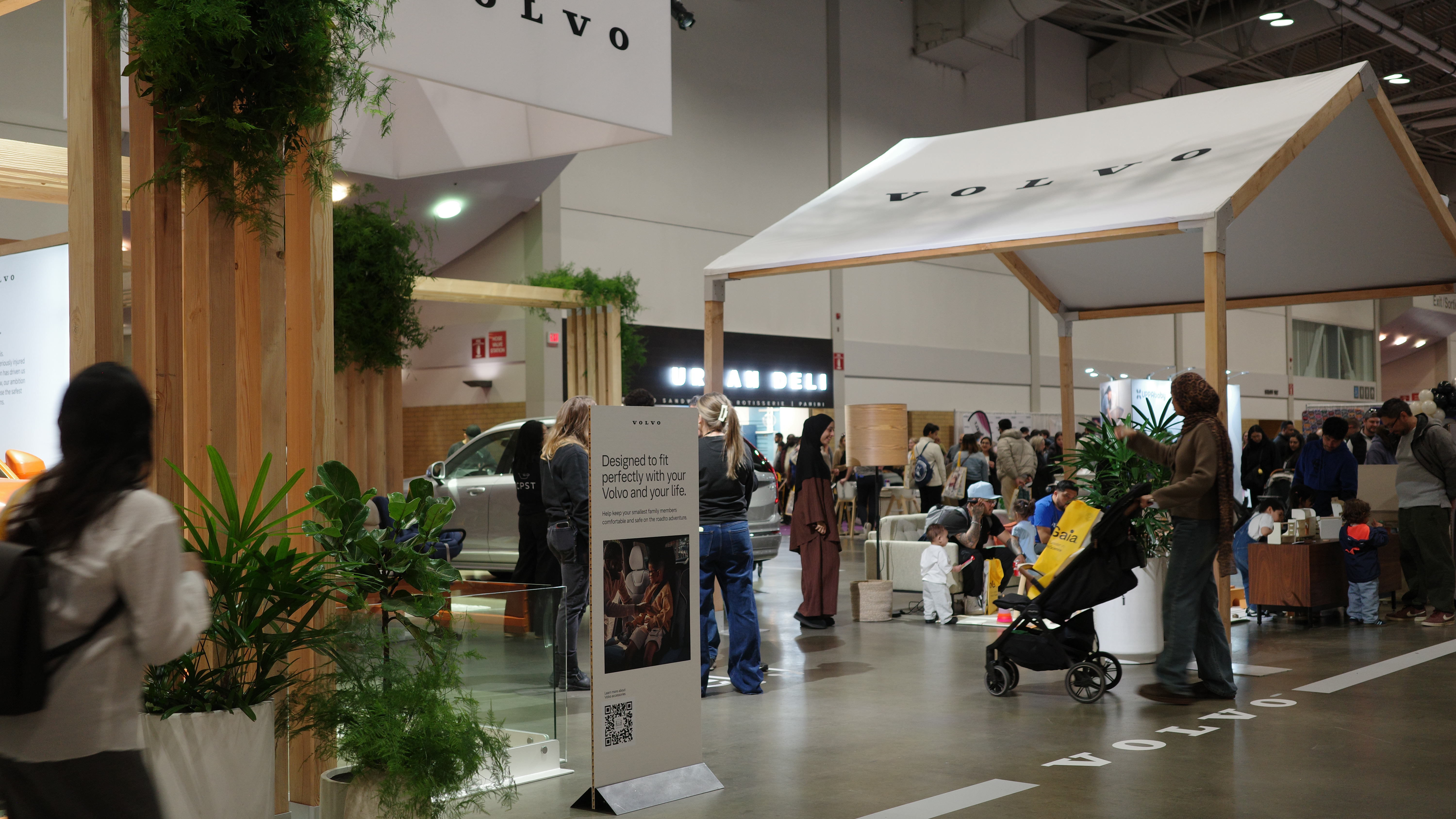
Typographic identity system designed for the PEZ Visitor Center via the creation of a new (yet nostalgic, reminiscent of its packaging in the 60s) logotype and extended it via the use of pattern in various branded materials. Design concept was grounded in the flip-opening of PEZ candy dispensers and bringing interactive fun out of its rich brand history, which is a focus of the museum.


