PREP-PROS is a local grocery mart that offers fresh, nutritious ingredients alongside trainer-designed meal-preparation services 24/7. The core objective in developing this identity was to communicate a lifestyle that feels effortless and structured—
flexible enough for busy routines, yet rooted in intentional living.
flexible enough for busy routines, yet rooted in intentional living.
At the heart of the visual is a bold logomark combining script-like typography with confident strokes. The handwritten quality of the letterform introduces a sense of ease and familiarity, echoing the brand's mission to support real people making real food choices. The subtle integration of a clock motif embedded within underscores both the structure and rhythm of meal-prepping, also highlighting the brand's round-the-clock accessibility.
The color palette draws inspiration from natural superfoods such as purple grains, eggs and leafy greens, bringing a rich, grounded, yet refined quality to the identity. These tones, along with clean typographic systems and balanced labeling forms reflect
the brand concept of organic simplicity.
the brand concept of organic simplicity.
From produce stickers to food-grade recycled wrapping paper doubling as educational print on portioning, the design system extends across every part of the in-store experience.
*This is a conceptual branding project for a 24/7 grocery store.*
*This is a conceptual branding project for a 24/7 grocery store.*
BRAND ESSENCE
PREP-PROS is a Toronto-based grocery mart founded by a team of personal trainers who believe that nourishing food builds strength and that sustainable health is rooted in flexibility. By offering a thoughtful blend of fresh ingredients, whole foods and nutritious ready-to-enjoy meals that fit real life, PREP-PROS makes sustainable eating habits accessible and intuitive.
PREP-PROS' vision is to reshape how modern people experience healthy living - making it feel natural, empowering and achievable.
PREP-PROS' vision is to reshape how modern people experience healthy living - making it feel natural, empowering and achievable.
DISCOVER NEW FLAVOURS
PREP-PRO'S Ingredient-focused guidebooks help customers get the most out of what's in the kitchen and to expand their palate as they pass by grocery aisles. It's a smarter and more sustainable way to eat—a great way to fall in love with cooking again.
PREP-PROS: LABELS & PACKAGING
THE LABELLING SYSTEM
Extended from the circular motif of a clock, PREP-PROS's labelling system stands as an expression of the brand identity—one that is deeply rooted in simplicity and structured living. From fruit stickers to food-grade wrapping paper for dry goods, every form, materials, printed content and colors are carefully considered to evoke a sense of harmony with nature and reinforce the meaning of modern living. By maintaining consistency across every label, our goal is to offer a tactile visual experience that feels both grounded and elevated.
Food-grade recycled paper is used as wrapping for miscellaneous grocery goods such as onions, garlic or fruits,
all while doubling as a large informative print that highlights shoppers on food portioning tips.
This choice not only supports sustainability but also reinforces PREP-PROS' commitment
to conscious and structured living through every touchpoint.

Breakfast Bites
Plant-based Lunch Kits

Dinner Kits
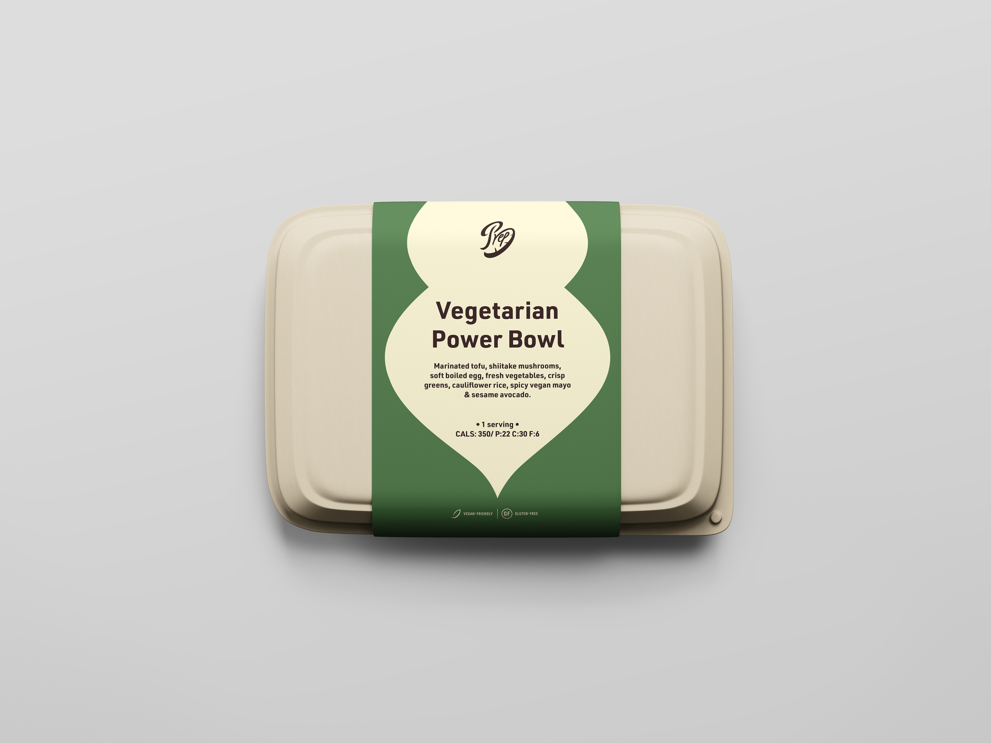
TAKEOUT BOX SLEEVES
In the meal kits' box-sleeve designs, position of the brand motif is relative to the recommended time of consumption (morning/ mid-day/ dinner time). The primary brand color was used for the ribbon are standard ready-to-eat kits while the green alternative represents plant-based options as a quick and easy way to differentiate the two.
SINGLE-PORTIONED GROCERY KITS*
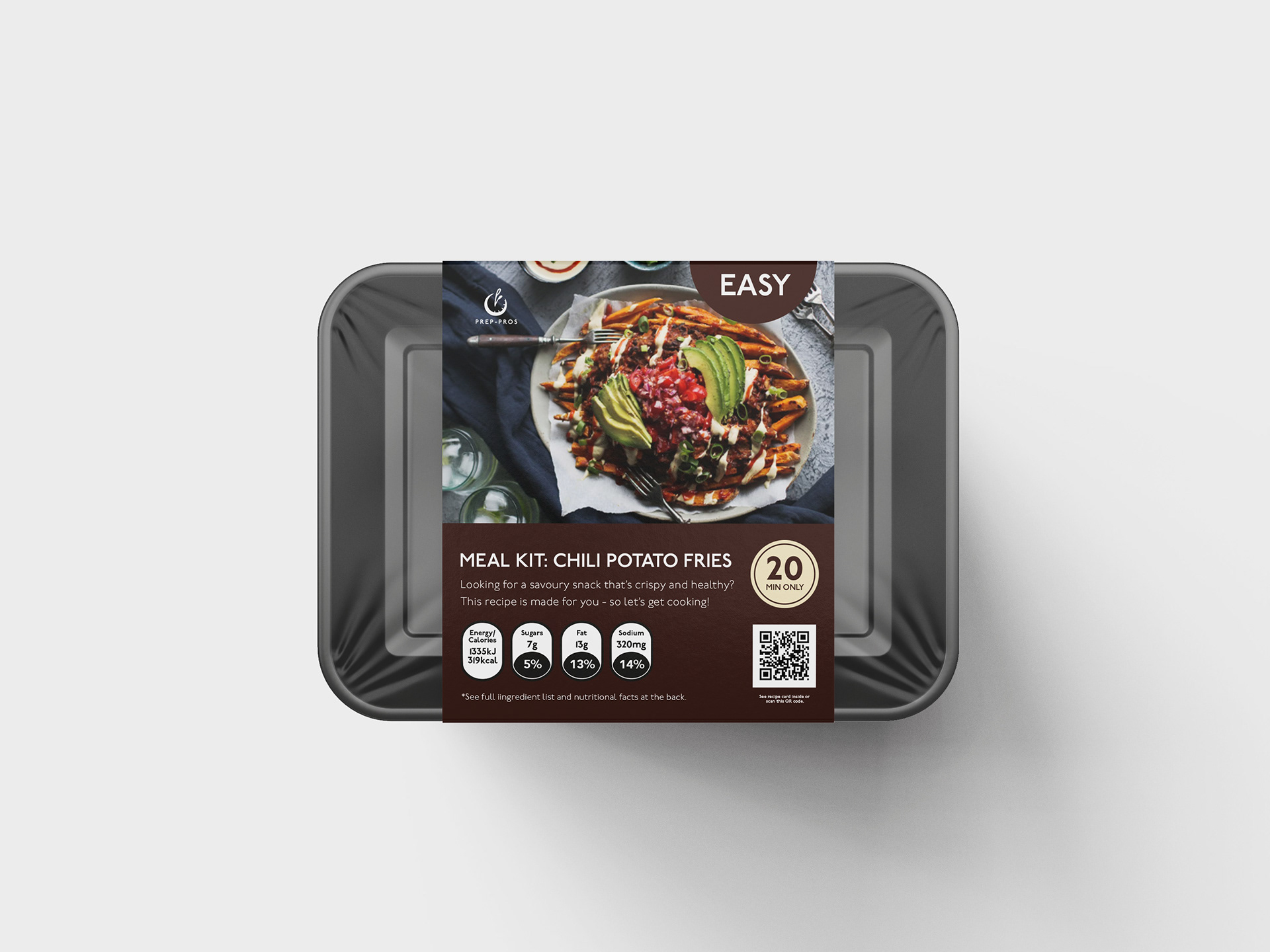
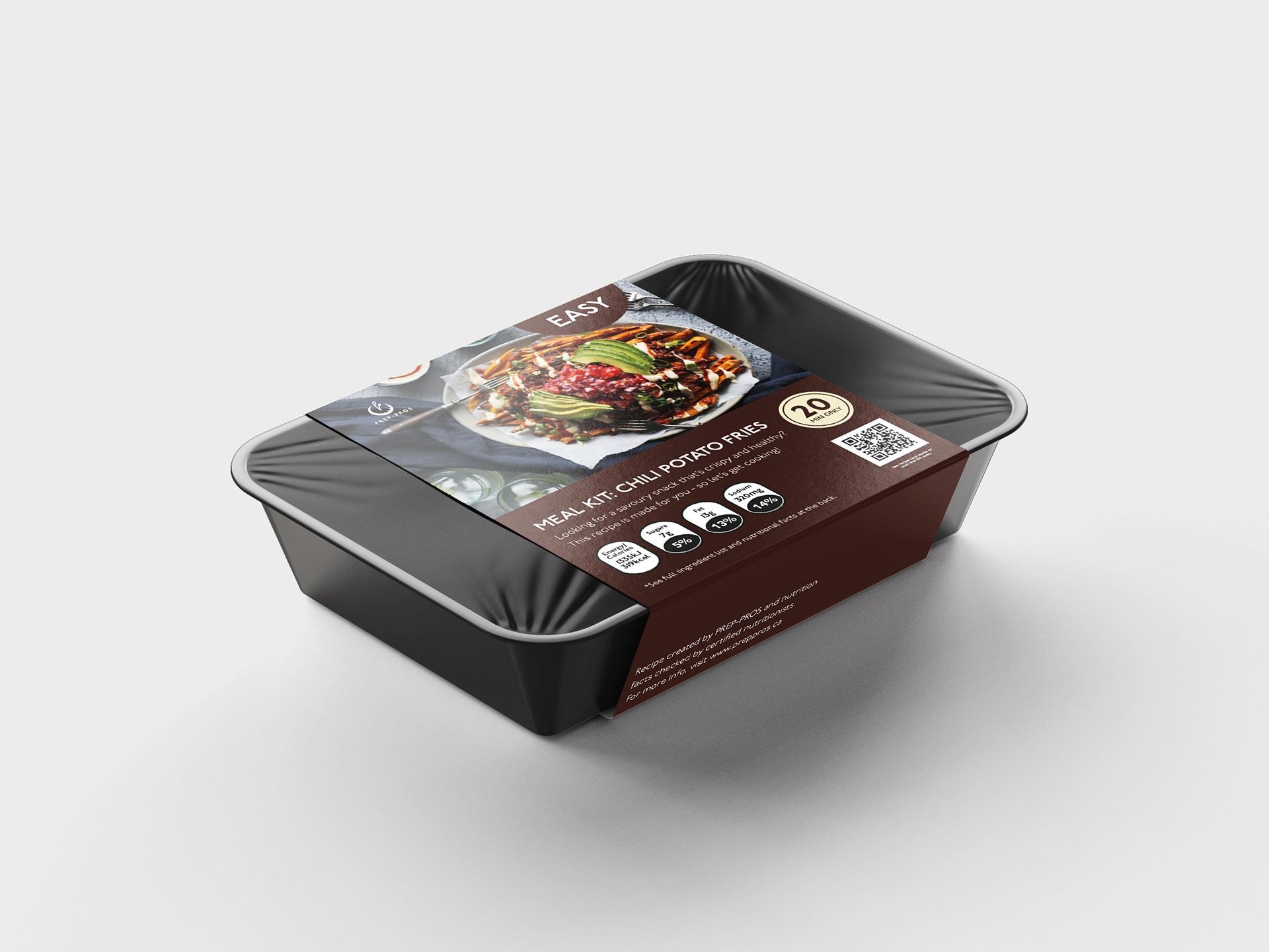
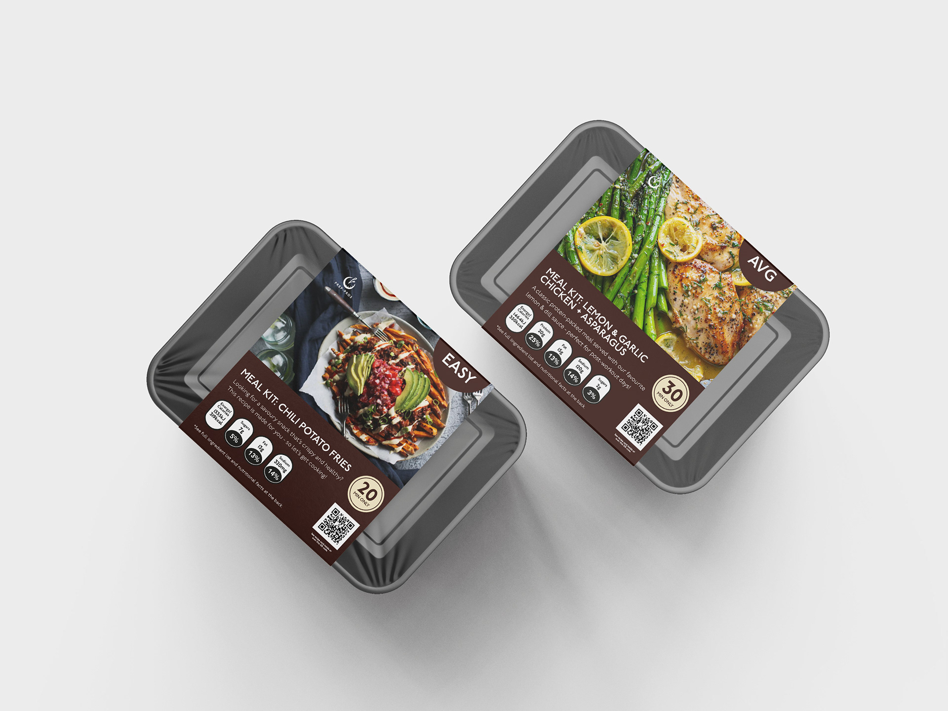
Unlike the cooked meal kits, these containers are more plastic-based - such that contents can withstand different temperatures (room, refrigerating , freezing temperature) and stay protected from potential damages during shipping/ customer-interaction in store. Transparent covers of kits will also provide better visibility during the shopping experience.
On the sleeve, pictures of the cooked meal and details about the dish’s nutritional information, preparation time, recipes etc. are included as well.
*imagery to be updated
*imagery to be updated
NEXT STEPS (WIP)
THE DIGITAL EXPERIENCE
For those who may prefer ordering online, PREP-PROS offers a digital storefront and
mobile app, which is an extension of the website that will includes a
shopping catalogue, meal plans and customization options.
mobile app, which is an extension of the website that will includes a
shopping catalogue, meal plans and customization options.
SOCIAL MEDIA
To connect and enhance the brand’s modern and fun image through creating an online presence and engaging with people in different demographics.

